©
Date
Aug 2025
Client
FinFlow
Industry
FinTech & Payments
Timeline
3 Months
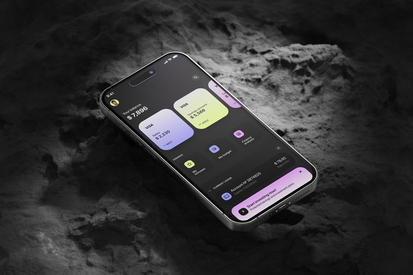
The Real Problem
The core issue was not missing features. It was lack of clarity.
Everyday actions were buried under layers, dashboards were cluttered with competing options, and simple tasks felt heavier than they should. "Why does sending money take so many steps?" "I just want to see my balance and recent activity quickly." "I am never sure if the payment actually went through." Instead of feeling effortless, everyday transactions demanded unnecessary attention — and offered too little reassurance in return.

Finding the Fix
A focused home screen, a streamlined payment flow, and feedback users can trust.
We prioritized primary actions — send, receive, scan — and moved secondary features deeper, cutting decision time on the home screen. The payment flow lost its extra input steps while keeping the necessary checks, making transfers feel fast but safe. The confirmation state got the biggest upgrade: from a minimal message to a clear summary of amount, recipient, status, and reference details — because in payments, reassurance is part of the product.


What Changed
The experience shifted from fragmented to seamless.
Faster access to balance and key actions, fewer steps to send money, clearer transaction history, and stronger confidence through explicit feedback. The lessons carry beyond payments: simplicity drives frequency in daily-use apps, primary actions must stand out, and trust comes from feedback — users need to see clearly what just happened with their money.

Latest projects